DARCSS theme - Construct 3
A downloadable Theme
What is DARCSS?
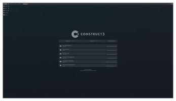
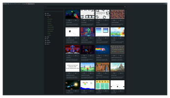
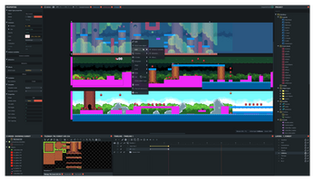
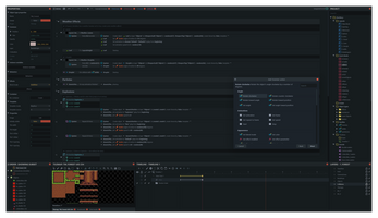
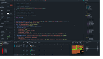
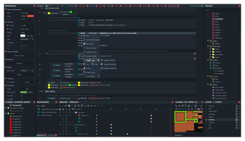
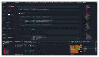
At first glance, DARCSS may look like just a theme, but it's so much more in reality; It's a whole project aimed to expand your experience inside the construct 3 environment to give you the power to do more, starting now with a beautifully crafted and professional theme (DARCSS) following then with a suite of tools and functions (DARCTIME, coming soon) all in one single bundle. If you believe that construct deserves a better look than what the default options offer, then I hope you will enjoy this suite of addons as much as I enjoyed making them.
| Suitable for both experienced and beginner users | |
| Professional look, no more toy-like UI | |
| Easier on the eyes, it's a dark theme! | |
| Less straining for your OLED/AMOLED laptop's battery | |
| Minimalist design, more screen estate for you! | |
| Removes unnecessary bloatware for a cleaner experience | |
| Carefully color-coded to improve first glance readability | |
| Smart scroll-snapping for an easier navigation | |
| Extended customizable styling ( coming soon ) | |
| External script loading ( coming soon ) | |
| And much more to be unveiled soon... |
Got questions? Get in touch!
Twitter: twitter.com/mitsuhashish
Facebook: fb.com/mitsuhashish
Patreon: patreon.com/mitsuhashish
Discord: discord.gg/TrwmVnc
Support: discord.gg/TrwmVnc
The support board has been moved to my discord, feel free to join to get in touch with me personally!
| Status | Released |
| Category | Tool |
| Release date | Jul 18, 2021 |
| Rating | Rated 5.0 out of 5 stars (2 total ratings) |
| Author | mitsuhashish |
| Made with | Construct |
| Average session | A few hours |
| Inputs | Keyboard, Mouse, Gamepad (any), Touchscreen |
| Links | Support, Community, Twitter/X, Facebook |
Purchase
In order to download this Theme you must purchase it at or above the minimum price of 15.00€ EUR. You will get access to the following files:
Development log
- minor update v1.0.1.3Feb 06, 2022
- Huge update! v1.0.1.2Jan 31, 2022




Comments
Log in with itch.io to leave a comment.
Hi, is this still being maintained? Been about a year since you've updated your dev log.
I haven’t had any report of broken stuff lately, and there hasn’t been any breaking updates by scirra afaik
I am so grateful and thankful for all the help I’ve received from Mitsuhashish ( @mitsuhashish ). He has been an amazing asset in making my Construct 3 augmented reality 3D mobile game.
Andrea coded the extremely complex base for the game. Most importantly programming the gyro features making it possible to use the camera/phone movement to control the game play. He’s extremely patient, gives wonderful technical support and makes himself available for questions long after the final purchase.
On a scale of 1-5, Mitsuhashish is a 10!! I couldn’t be more pleased.
Hi Mistsu,
I was excited to see this and have purchased it, it looks awesome.
Not sure if you remember me but I still haven't finished my space game yet - perhaps I still need more tutoring sometime hahaha. Good to see you're busy - Cheers m8!
Hey o/ ofc I remember! I’m glad you like it, feel free to hit me up whenever you want even if just for a chat, I’d love to catch up!
How is this not the itch.io theme?! Incredibly polished and responsive. Theme for construct is fire!
This is fantastic. I'm loving it so far!
looking pretty good to me - on a 49 super ultrawide monitor.
It looks great! But could you brighten the GUI for rearranging the toolbars? Try to move the "layers" toolbar to the left side of the screen, it's very difficult to see the indicators that set the toolbars to new positions. Thank you!
Yoh, thanks for the report, could you please reach me out in the discord to better explain your issue? I’m afraid I didn’t quite understand what you are talking about x)
Thank you! I’m glad you like it x)